U.N. Global Pulse Visualization
This visualization requires a browser with SVG Support and Javascript 1.8. Internet Explorer is not supported. We recommend Firefox 4 or Google Chrome. In case you are not able to see the visualization, you can download an image here.
Authors
We are Eduardo Graells Garrido and Ruth García Gavilanes. We are phD students from Universitat Pompeu Fabra doing an internship at Yahoo! Research Barcelona. Our advisor is Dr. Ricardo Baeza Yates.
Purpose of this visualization
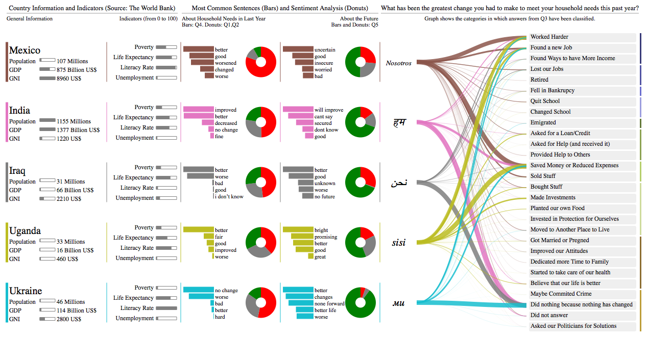
This is a visualization for the UN Global Pulse visualization contest. The goal was to visualize the results of a large-scale survey made in 5 countries: Mexico, India, Iraq, Uganda and Ukraine. The survey was about how the people in those countries are dealing with the effects of the global economic crisis.
The purpose of the challenge is to help the answering of the following questions:
- How do people in different nations describe their quality of life?
- What types of changes do people make in order to cope with economic uncertainty?
- How do individuals perceive their future outlook?
We also used some indicators from The World Bank.
Visual Approach
Our visual approach is based on small multiples, to compare easily the different results and indicators from different countries. However, since the original data is mostly subjective, we felt that we needed a way to visualize the different kinds of replies by the people. We made the following things: we counted the most common words used in questions 4 and 5 (represented as bar plots), we analyzed sentiments using questions 3 and 5, and we created a categorization for the answers in question 3. Then we created a answer graph that mapped countries to the different answer categories, to show if people in different countries made different changes in their lives.
We also added a human "touch" to the answer graph because it has the form of "We ... did something" (where did something is the answer category). We replaced "we" with the corresponding translation for each country. The translation was provided by Google Translate.
Data Classification
Past and Future
We separated the data into answers related to the future and the past. We believed that questions 1,2 ,3 and 4 were answers related to the past and question 5 was the only one related to the future.
Categories
We believe that it is not practical to classify natural language answers manually. It is better to develop innovative methods to classify them automatically. In this case, we adopted a very simple method to automatically classify answers in natural language. It is not the most efficient method and it needs improvement but it allows us to expand our approach to different data sets and more surveys in the future.
About the Bars in Past and Future
The bars show the most common words in the answers of each country excluding stop words and sentences that were too ambiguous. The intention of the bars is to show the most common words and sentences used per country. In this way, the bars "Past Section" contain the most common words for the answers to question 4, whereas the bars of "Future Section" show the most common words of answers to question 5.
About the Donut Charts
In the case of the donut chart in the "Past Section", we used the answers from questions 1, 2 in order to determine a positive (green), neutral (gray) or negative (red) sentiment. Since in questions 1 and 2 the answers were based on options, we assigned a score to each option and then used the total score to determine the sentiment. It is interesting to note that in some countries the prominent sentiments are opposite with the most common sentences. This is a natural effect derived by the subjective nature of the survey.
On the other hand, we classified automatically the answers to question 5 into positive, negative, neutral, empty and undetermined for the "Future Section". For the donut chart, we used only the results of "positive", "negative" and "neutral".
Tools Used
- Java - processing of answers.
- Python - processing of answers.
- CoffeeScript - programming. The output is a Javascript file used in the browser
- d3.js - visualization library in Javascript.
Conclusions and Recommendations
We feel that it is very important to visualize results of surveys in ways that can be easily interpreted by authorities and the general public. In this case, we wanted to emphasize two phases : the future and the past. We also feel that it is important to provide interactive visualizations in order to provide more robust information about surveys specially those involving free text answers. We consider this visualization a first step and we look forward to provide interaction in the future.
Although we tried hard to show the results of answers to question 3 and 5, since we thought they were very important, the big problem that we have faced is to classify natural language with grammar errors and ambiguity. We assume that the translations were not made by humans but instead by automatic translators and therefore several grammar mistakes and ambiguity were kept. In cases where multiple choice questions cannot be given in surveys, we advice to provide answer options such as questions 1 and 2. In this way people will limit their answers to the options given. The risk of given freedom of answer such as question 3, 4 and 5 is that answers cover other topics that are not related to the question.
Last updated on July 25th, 2011.